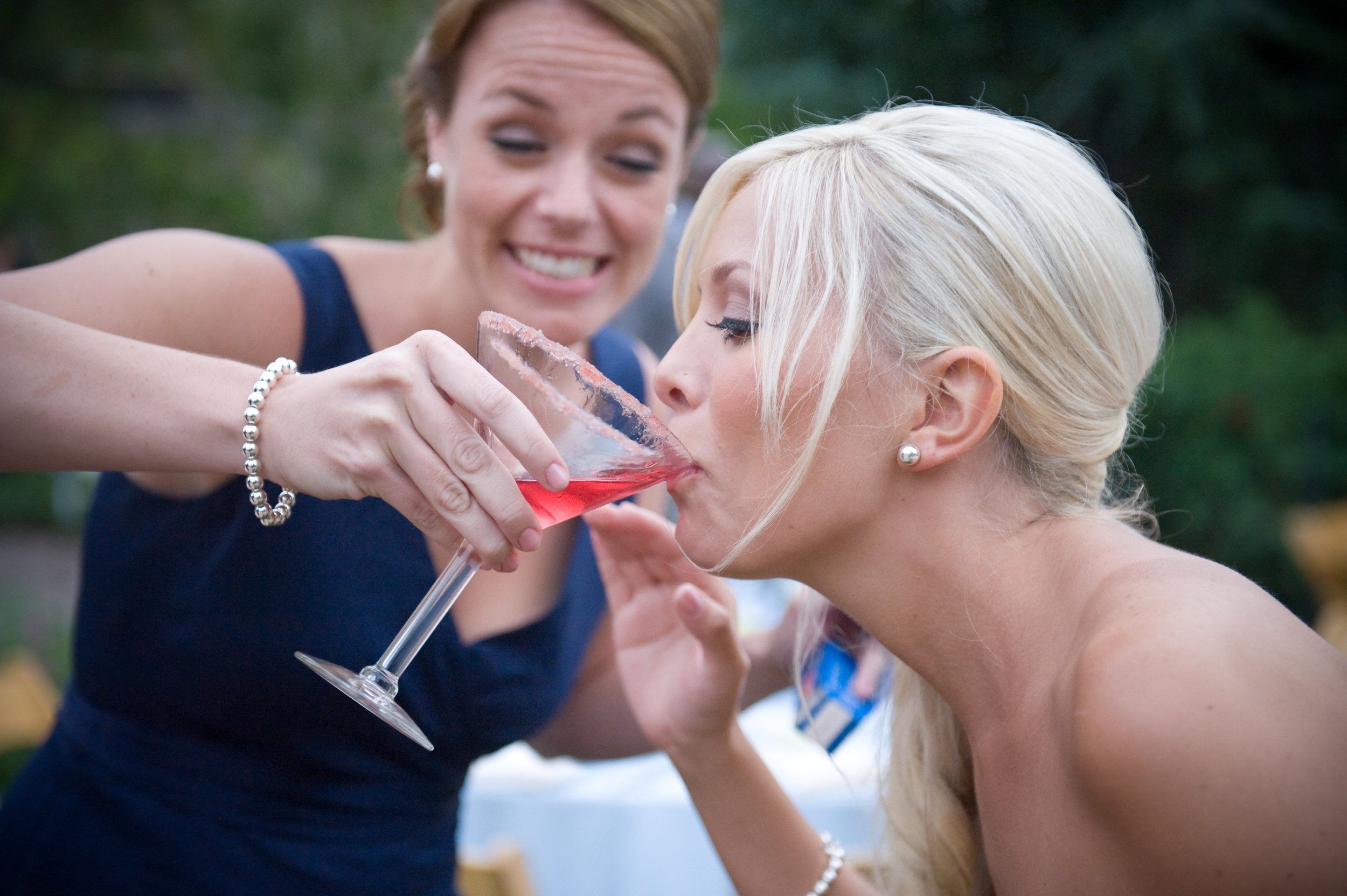
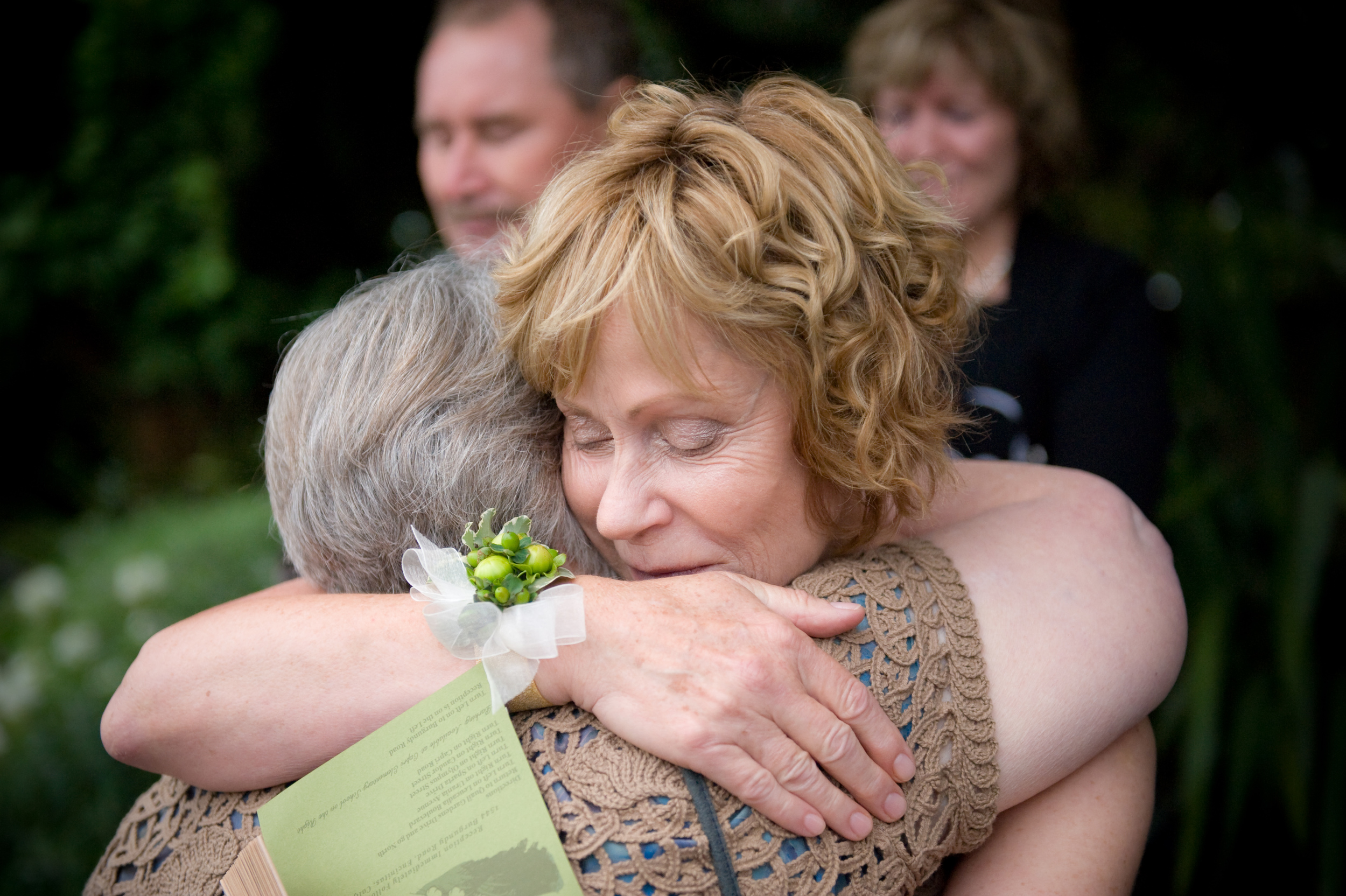
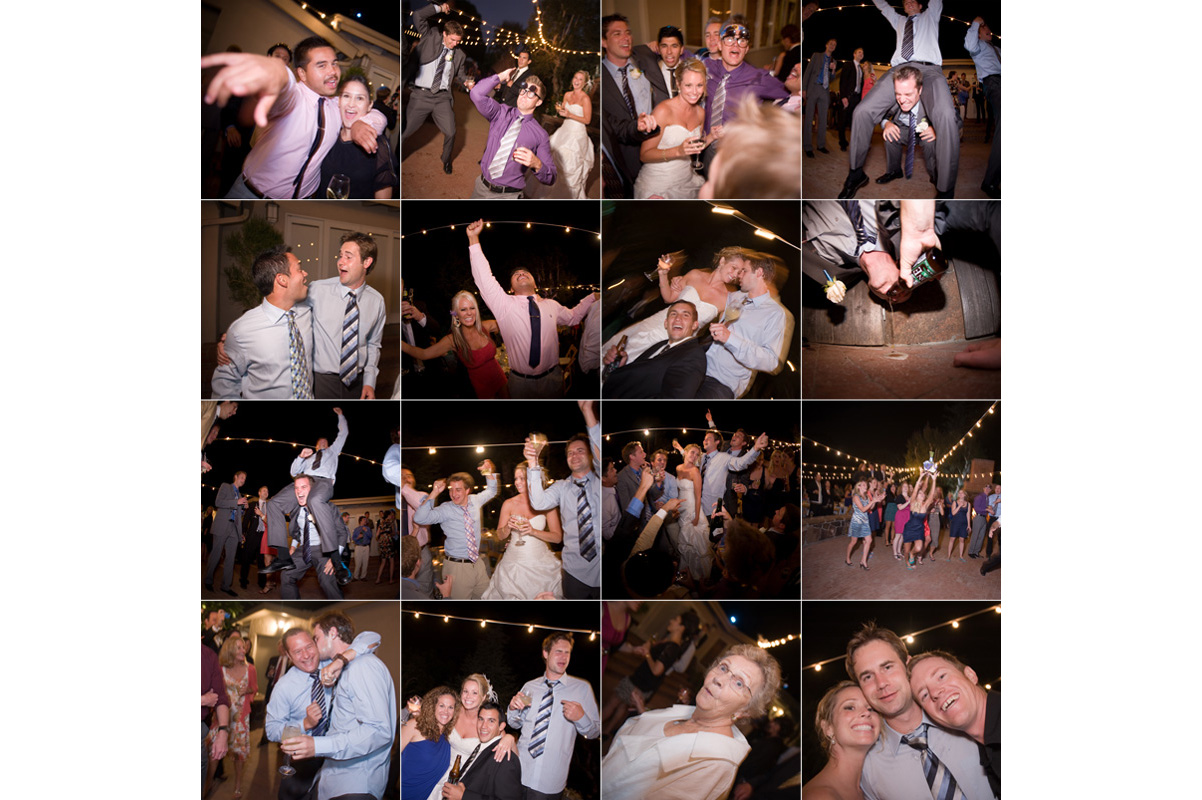
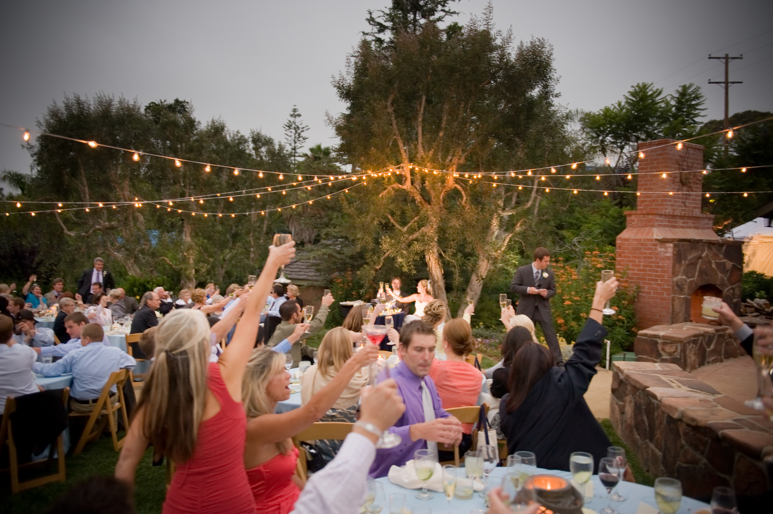
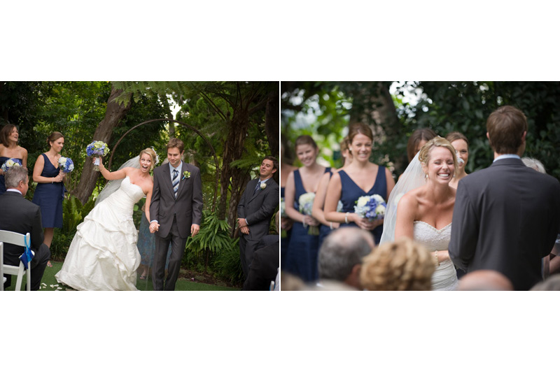
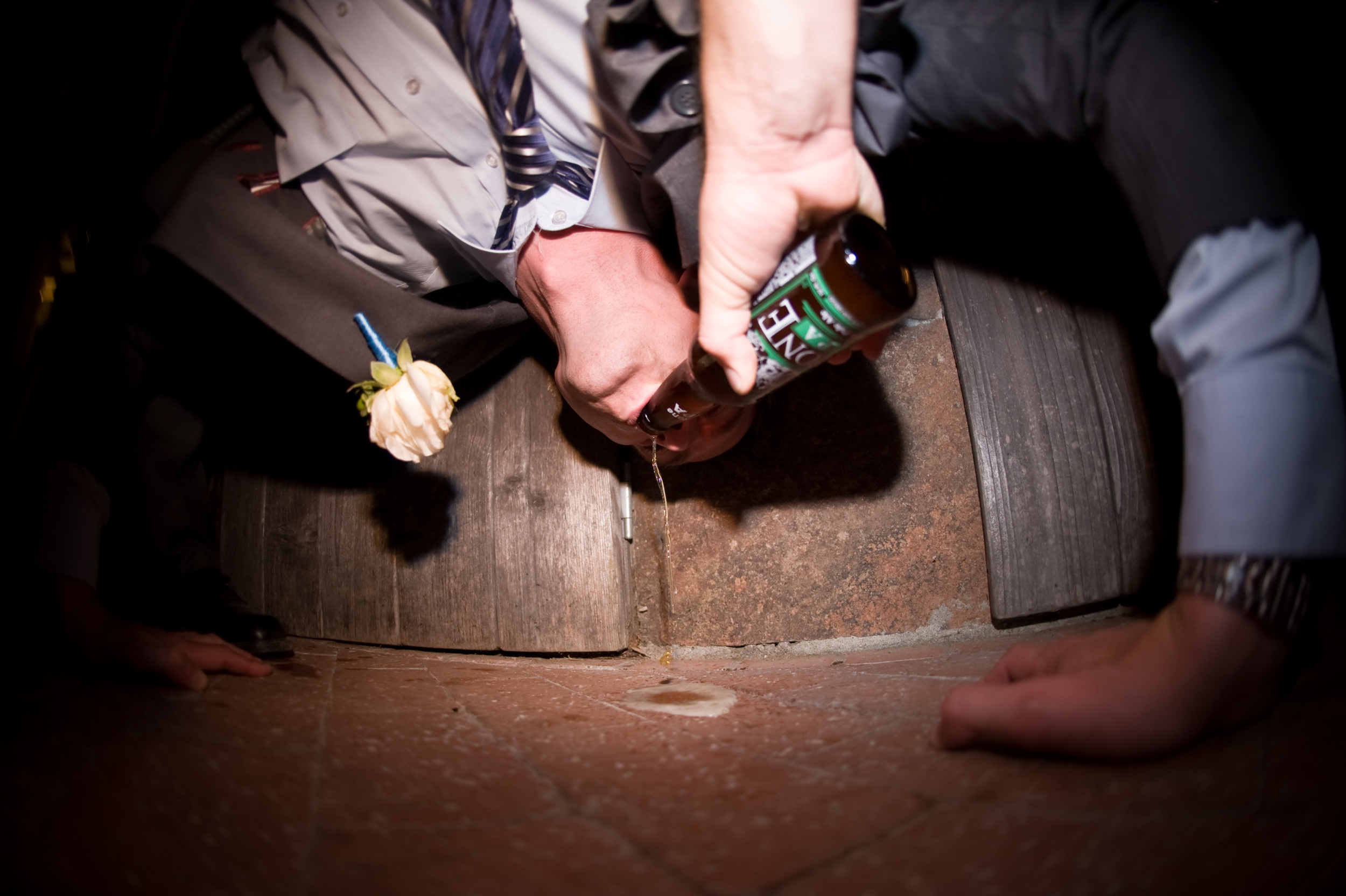
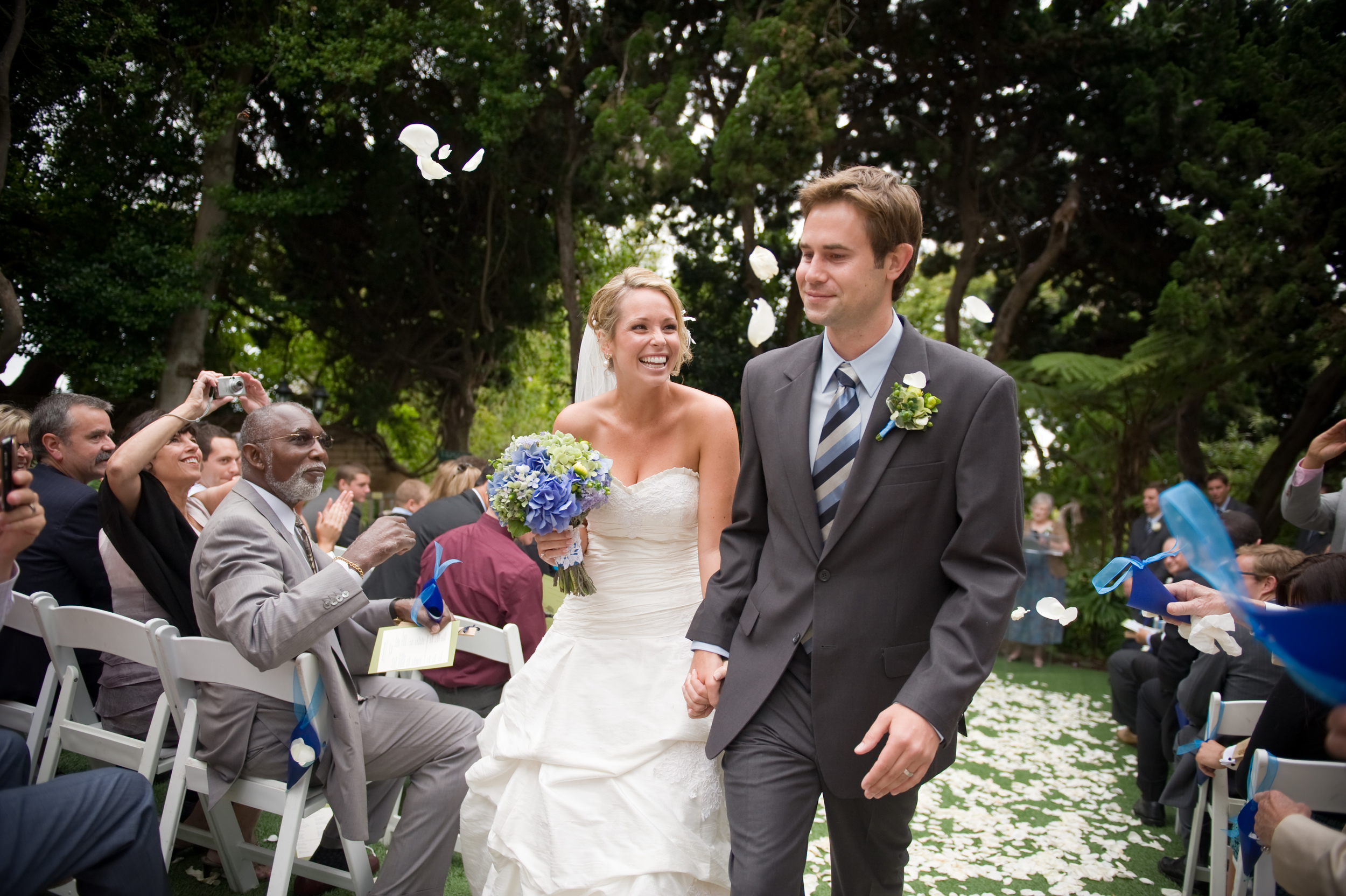
Selecting images to represent my work is always a challenge. Two photographers could choose completely different images from the same set of images. This selection or "edit" is similar to the editor of a movie and is critical to the final representation of the wedding. The image set I choose is the second half of the creative process and supports my theory of wedding coverage. Below are two posts from the same wedding. Post #1: A polished selection of the perfect shots; immaculately cropped, perfectly timed, color balanced, tweaked and ready for a magazine spread. Post #2: imperfect raw moments, no magazine spreads... however, illustrative... Which set moves you the most? Which set truly sets my work apart from the crowd? What if you don't know Ashley and Alec? Well, now is your chance to weigh in. No more lurking. Below are two posts, the first set of images are magazine-ish, cropped out and tweaked. The second... we'll tell me what you think. What would you rather see?
NOW FOR THE RAW
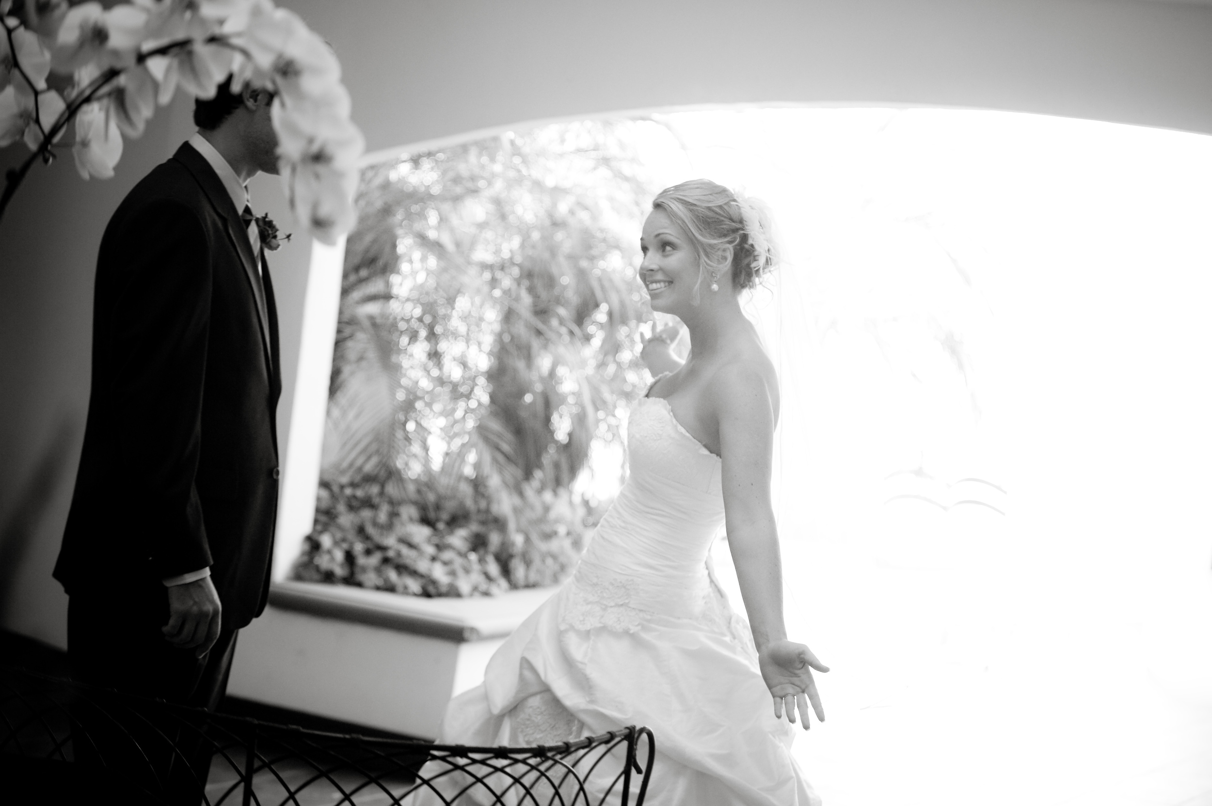
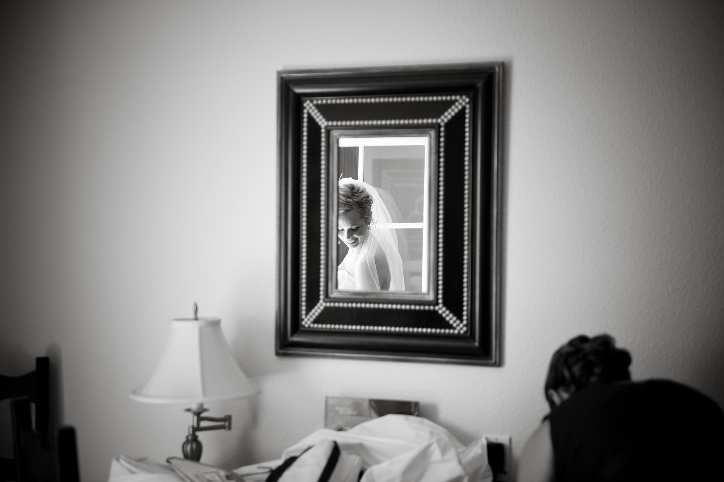
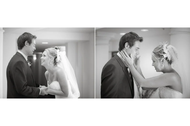
These captures have some flaws, but are also very powerful. Obviously, this image would have been better without the flowers in front of Alec's face. But is it so distracting we lose the strength of this moment? It's surely not magazine content, however... what this image does show is the truth in Ashley's eyes, you know exactly what she is feeling and thinking: ... "you know me ... all our time together and here I am ... that girl you fell in love with... in a wedding dress!"... they are about to leap off that cliff of marriage together and trust each other with everything.
